Hi 👋🏻 I'm Georgi,
a digital designer driven by curiosity, structure, and a strong desire to solve real problems through meaningful digital solutions.
I earned a Master’s in Entrepreneurship and Technology and a Bachelor’s in Multimedia techology and design from the University of Agder. My education gave me a unique mix of design, technology, and business insight – helping me understand how to create digital solutions that are both user-centered and impactful.
In my free time, I enjoy training, reading, and spending time in nature. I’m also passionate about continuously expanding my design skills and learning new approaches.
Skills & Tools
UX/ UI
Other
ux-dESIGN
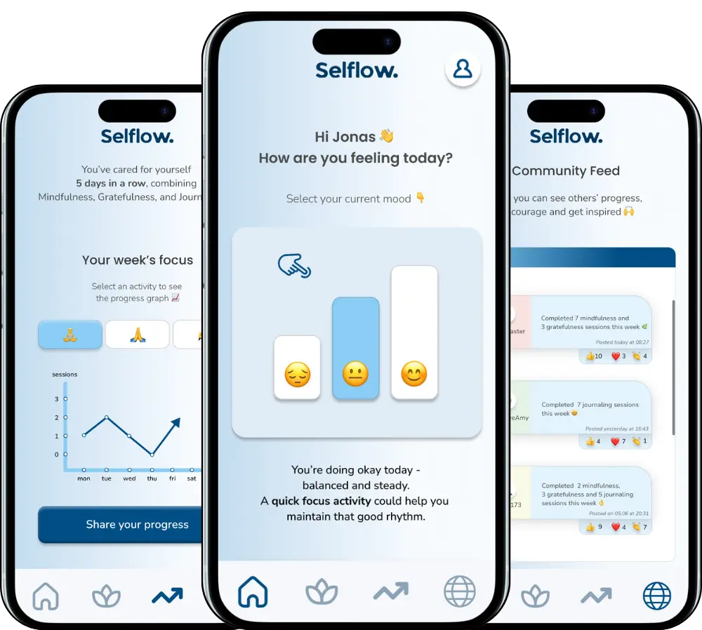
Selflow app
Selflow is a well-being app designed to help people slow down, reflect, and care for their mental health in a gentle and structured way. The app combines mindfulness, journaling, and gratitude practices into a calm daily routine that adapts to each user’s mood and progress. Its purpose is to make self-care feel natural and rewarding rather than forced or time-consuming.
#DesignThinking #UserResearch #UsabilityTesting #Prototyping
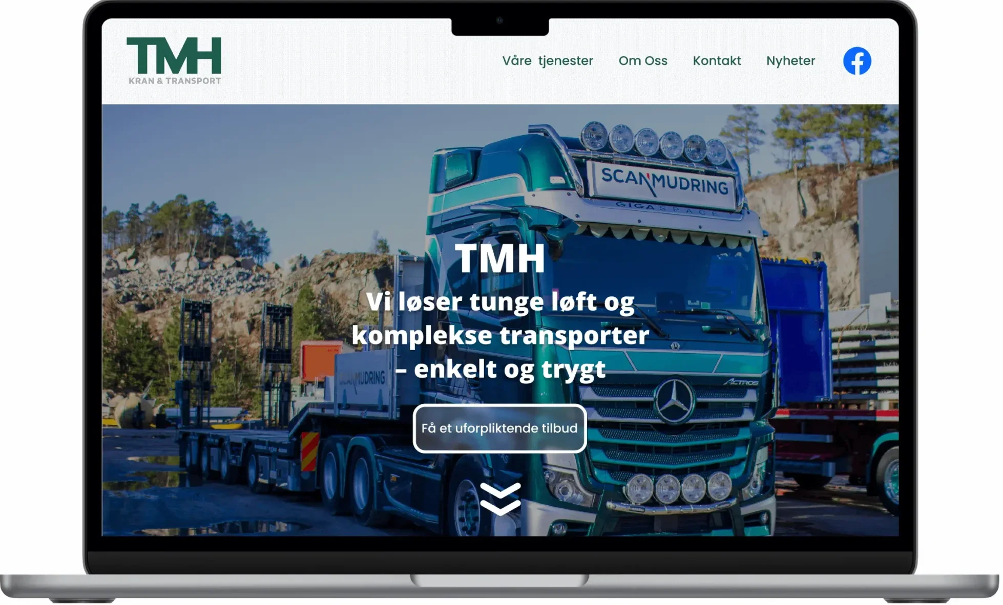
TMH Redesign Case
This conceptual website redesign focuses on improving clarity, structure, and user flow in order to help visitors quickly understand the company’s services and initiate contact with confidence. The goal of the redesign is to reduce friction, strengthen trust, and turn the website into a functional tool that supports real user needs rather than a passive information surface.
#UX-design #HeuristicEvaluation #Prototyping #Figma
oTher projects
Web Design

A website designed and developed for Startup Fundamentals, an entrepreneurial platform that helps people turn their strengths and passions into online businesses. The goal was to create a professional and motivating digital presence that communicates clarity, trust, and progress. Built in WordPress with Elementor Pro, the site combines clean visuals, an intuitive structure, and fully responsive design. I developed the complete brand identity, wrote all copy, and optimized the site for SEO and performance to ensure a smooth, engaging user experience across all devices.

A website designed and developed for Startup Fundamentals, an entrepreneurial platform that helps people turn their strengths and passions into online businesses. The goal was to create a professional and motivating digital presence that communicates clarity, trust, and progress. Built in WordPress with Elementor Pro, the site combines clean visuals, an intuitive structure, and fully responsive design. I developed the complete brand identity, wrote all copy, and optimized the site for SEO and performance to ensure a smooth, engaging user experience across all devices.
Other websites
These websites represent a selection of projects I have worked on as a freelance web designer and during my internship at a digital agency.
The focus has been on creating modern, responsive, and user-friendly solutions that give clients a strong digital first impression. The projects range from my own concept developments to tailored solutions for small businesses and independent professionals — all aimed at combining functionality, clear communication, and professional design.
Graphic Design
“Get or Give” poster
- Adobe CC
This poster is a typographic experiment focused on contrast, depth, and reflection. The text “Get or Give” is integrated into a dramatic landscape photo, balancing between solid and outlined letters. Through the combination of photography and typography, I explored how visual elements can convey a dual meaning – both literal and symbolic. The poster uses layering and transparency to create movement and visual interest.
“Bølgen” poster
- Adobe CC
This poster is inspired by the visual language of modernism from the 1920s to the 1940s. With a clear geometric form and a limited color palette, the design reflects the functionalist aesthetics of that era. The title “Bølgen” (“The Wave”) refers both to the movement in the shapes and to the style’s influence on graphic design. Typography and lines are precisely structured, offering a modern take on classical composition. The poster was created as part of a project on graphic design history.
"ICONS Nr. 5" poster
- Adobe CC
This is a tribute poster to design legend David Carson, known for his groundbreaking work in grunge typography. The poster imitates his experimental and unconventional style, featuring distorted typography, high contrast, and fragmented imagery. I deliberately broke traditional layout principles to convey the same raw and rebellious expression that Carson is known for. Text and image intertwine to challenge readability and interpretation.
“Get or Give” poster
- Adobe Illustrator
This poster is a typographic experiment focused on contrast, depth, and reflection. The text “Get or Give” is integrated into a dramatic landscape photo, balancing between solid and outlined letters. Through the combination of photography and typography, I explored how visual elements can convey a dual meaning – both literal and symbolic. The poster uses layering and transparency to create movement and visual interest.
“Bølgen” poster
- Adobe Illustrator
This poster is inspired by the visual language of modernism from the 1920s to the 1940s. With a clear geometric form and a limited color palette, the design reflects the functionalist aesthetics of that era. The title “Bølgen” (“The Wave”) refers both to the movement in the shapes and to the style’s influence on graphic design. Typography and lines are precisely structured, offering a modern take on classical composition. The poster was created as part of a project on graphic design history.
"ICONS Nr. 5" poster
- Adobe Illustrator
This is a tribute poster to design legend David Carson, known for his groundbreaking work in grunge typography. The poster imitates his experimental and unconventional style, featuring distorted typography, high contrast, and fragmented imagery. I deliberately broke traditional layout principles to convey the same raw and rebellious expression that Carson is known for. Text and image intertwine to challenge readability and interpretation.
CERTIFICATES
Contact
Let's Connect
I’m always open to new opportunities, collaborations, or a quick chat about UX and design.
If you’d like to work together or just say hi — I’d love to hear from you.


